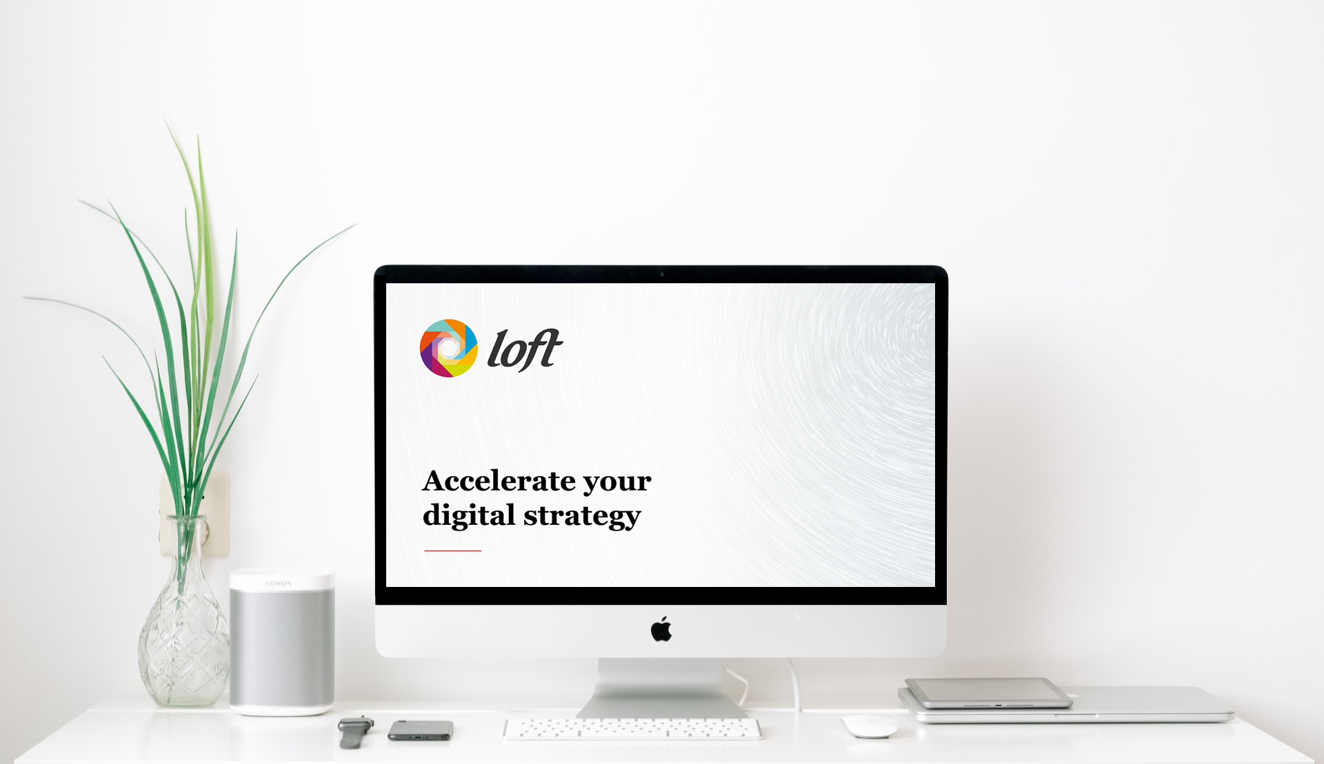
Our new logo is fresh, clear and colourful – it represents diverse and creative thinking with swift and precise execution.
Like many companies, lockdown gave us an opportunity to recalibrate and refresh our company strategy, including the Loft brand. A few weeks ago, we soft launched the new Loft logo and we’d love to know what you think.
The most obvious change is that our red dot has gone and the logotype has moved to sit aside our new circular mark, constructed from geometric forms in four pairs of complementary colours. Complex yet organised, layered and flexible, dynamic and collaborative – it has been designed to represent what we do, our values and our roadmap going forwards.
“We wanted it to tie in to the core brand and any products we might develop,” explains Loft’s UX lead Sam Scarles. “I worked through a number of ideas that would work for Loft as a whole, but could also be adapted for sub brands and products.”
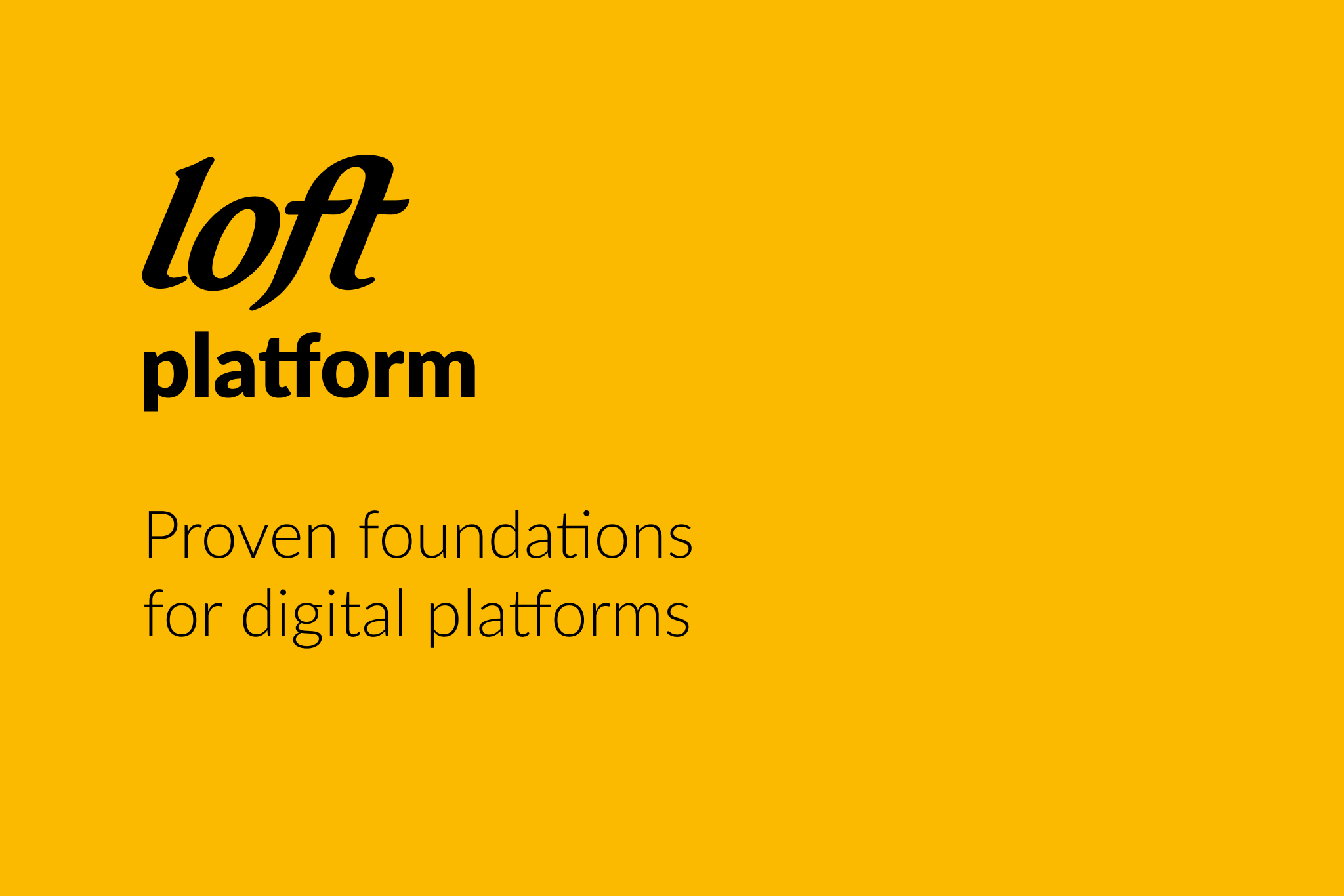
Loft is currently developing an innovative new platform for the digital health sector, modular applications that will extend its functionality for specific markets, as well as bespoke technologies for a range of other industries such as sustainable transport and finance.
Watch for more news on our new direction, coming soon…