Technology is bringing about a revolution in healthcare, and not just in terms of administration. The biggest potential in the digital health sector is in providing better services and better outcomes to patients. This will put much greater emphasis on accessibility, which means sometimes we need to put the norms of UX design to one side.
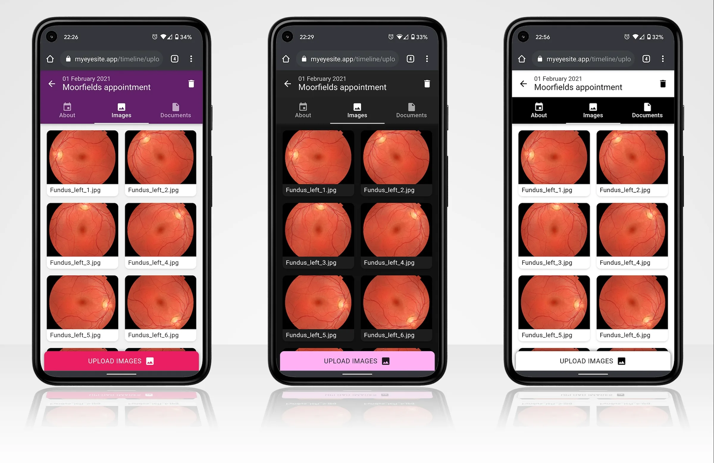
That’s certainly something we discovered while developing MyEyeSite, a collaboration between Loft, UCL and Moorfields Eye Hospital that aims to give patients with rare eye diseases greater control over their medical records. Users will have instant digital access to their files and be able to share them easily with the specialists they need to see prior to each appointment they attend. In addition, they can make the records available to researchers working to find better treatments for rare eye diseases.
It was crucial to the success of this project that we were able to design an application that blind and partially-sighted patients could use, and feel totally comfortable with while doing so. And we also wanted to engage patients in the design process itself, taking part in collaborative design sprints and providing feedback on early prototypes, to bring valuable input to the project’s direction. To achieve this, we had to focus on the accessibility not just of the application itself, but of our own working processes.
1. The basics of accessibility design
Most web and UX designers know something about accessibility, but very few actually use tools such as screen readers or have the motor skills that come through daily use of these essential applications. Instead, designers tend to rely on documentation and studies to discover how accessibility tools are used by those who need them.
While Loft favours a heavily used-centred approach to design, it is worth remembering that forming a theoretical platform is a good starting point, alongside aligning yourself with accessibility standards that large organisations have spent many decades and vast amounts of money researching and iterating on. We don’t need to reinvent the wheel.
Google follows a design standard called Material, which provides a useful set of rules – where to position things on a page; how to handle typography, colours and contrast; and how to engineer a site to work seamlessly with assistive technology such as screen readers. Material is a standard applied across Google products, meaning it’s inherently familiar to many users. You know where to find things if you’ve used an Android phone, Google Docs, Photos, Drive, and so on. We used Material as the foundation for MyEyeSite’s accessibility.
2. Design with and not just for the user
A project will always have a set of functional requirements that need to be met for it to be considered a success. As an analogy, does the lift go up, does it go down, does it ring for help when you press the alarm button?
However, many projects don’t come to fruition because their adoption rate is low, and many NHS tech projects win funding, reach their functional requirements, but never take off. Accessibility is a major factor in this.
At Loft, we’ve had success with MyEyeSite through our patient-focused approach. We have worked with patients from early research and design, through prototyping to alpha and beta phases. Patients who use the application are part of our project team, and we have worked with them throughout, from finding out what they need and want through to analysing how they use the product and discovering when, how and why their eye conditions mean there are specific barriers to their use of the application. We have been able to adapt, iterate and improve the accessibility of the application, with our users, at every stage.
3. Talk to the experts
We highly recommend engaging the expertise of specialist organisations who already work with potential users of an application. The benefits can be surprising. An hour’s targeted tuition from an expert can be a game changer and more valuable than many days spent researching patient profiles and/or disabilities. On top of that, connecting with people who are allied to your project is tremendously valuable.
In 2019, we presented designs to a lecture hall full of people whose range of sight capabilities and ages varied tremendously. Presenting something visual to blind and partially sighted people was a new challenge for us. We worked with the RNIB on our approach to the presentation, and learned techniques that helped us reach our audience, leading to a successful presentation and lots of valuable feedback and input into our designs.
4. Run workshops
Teasing out usability and functional requirements with users is one of the hardest aspects of design. It’s relatively easy to find out if something doesn’t work for someone; it’s much harder to identify just how to improve it.
Designers can picture in their mind’s eye how things fit together based on standards, media and experience. But most users can’t. They’ll know it when something isn’t right, sometimes they might have suggestions, but a lot of the time they won’t necessarily know what the solution is.
Workshops enable us to take small groups of people, throw stuff out there and see what sticks. Rapidly developing and documenting ideas can be a bit frantic but it proves valuable. A group of people also provides a good range of inputs – we’re not just getting one perspective, it’s balanced against other opinions within the group.
The patient days we held while developing MyEyeSite consisted of workshops that involved a broad swathe of users and enabled us to learn from their interactions with different parts of the application as we developed them.
5. Audit yourself
Before putting work in front of anyone, we get all the quick-and-easy accessibility wins out of the way. Otherwise, a lot of the feedback received will focus on obvious things that can be fixed in a few hours, and that may distract testers from the bigger picture.
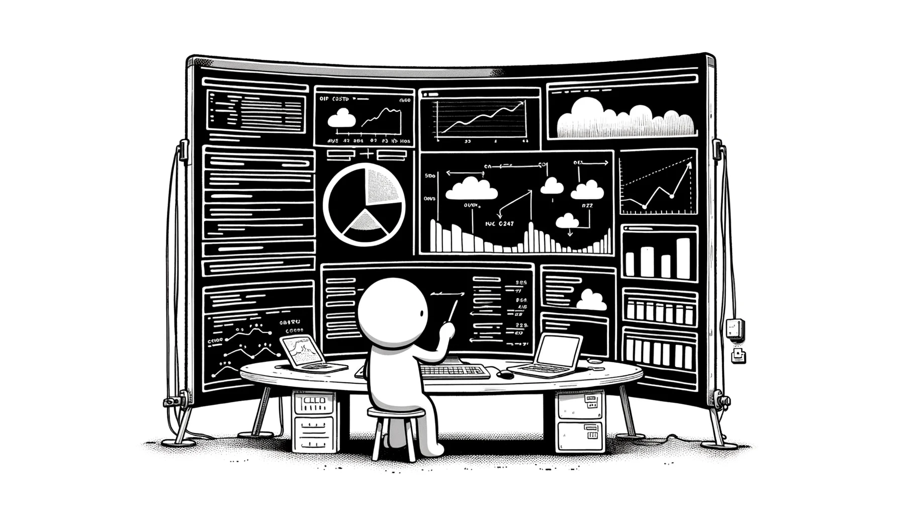
One of the best ways to do this is by using an automated accessibility audit. Google Chrome has a built-in tool called Lighthouse to do just this. Lighthouse will analyse a webpage on both mobile and desktop, then score it in a number of categories to produce an overall mark between 0 and 100. It will suggest things that can be done to improve the score that might have been overlooked. For example, screen readers benefit from ARIA attributes being attached to images/buttons and tab indexes that are set up correctly. We use tools like Lighthouse on all the sites we build, including MyEyeSite.
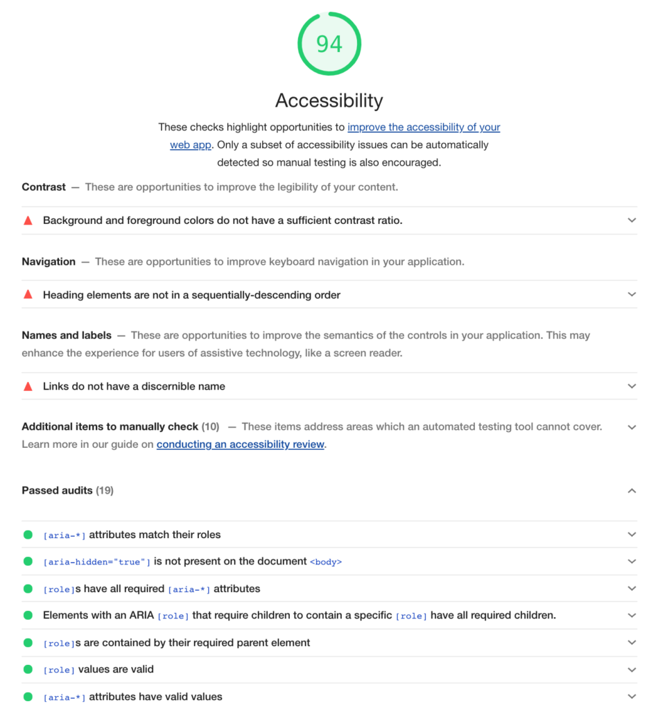
An example of a website accessibility audit.
6. Get certified
Depending on a project’s requirements, it may be necessary to have it certified for accessibility. The Web Content Accessibility Guidelines (WCAG) is the universal standard for web accessibility. While we can develop an application to meet these standards, receiving accreditation from a credible organisation will confirm to users and stakeholders that the site meets accessibility standards.
There are numerous third party services that we can use to test sites, ranking it either A, AA or AAA, according to various criteria within the WCAG standard. They are also able to suggest areas for improvement.
This method of assuring accessibility is better than using an auditing tool as it is more in-depth. For example, there may be alt text with every image, but does that text accurately describe the images in a meaningful way for someone who is using a screen reader?
7. An ongoing process
Modern projects are rarely linear. We typically work towards a milestone such as the initial launch, integrating findings from user testing, accessibility auditing and so on along the way. Then, features may be added, requirements evolve and often an initial project will lead to further applications.
Throughout this process it’s easy to drift away from the accessibility foundations that have been built. For this reason, it’s important to repeat the cycle we’ve outlined routinely and take stock when features inevitably get bolted on to check whether everything is still in line with the big picture or if it needs revisiting.
Changing digital health
On too many projects accessibility is still seen as a box to tick towards the end of a project, but at Loft we see the internet and new technology as an inclusive terrain. Whether we’re working in digital health or on platforms for other sectors, the only way to create technology that works is to understand users – and that means all users. Getting into that mindset is invaluable going forwards as it puts accessibility on the roadmap from the start of a project, giving its UX and functionality solid foundations that will last throughout the technology’s lifecycle.
To learn more about our work on MyEyeSite, read our case study here.
If you have any applications you’d like help with, or to learn more about our work, please do get in touch.