Some experiments in mapping travel times visually.
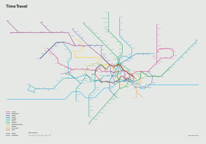
A while ago I discovered a great reworking of the London Tube map by Oskar Karlin, which displayed visually the time to travel from place to place. This is a great concept, because for Londoners travelling on the Underground, nearness is about how long it takes to get somewere, not how far away it is, and all Londoners know there’s not a lot of correlation between the two.
(Of course, the standard topological tube map doesn’t tell how far away things are, or even where they are – only how to get there).
Today I found a couple of elegant interactive versions, by Tom Carden, which enable you to choose a start point and view travel times from there in different ways.